
Choosing paint colors for your home isn’t just about picking what looks good on a swatch. The right paint can transform a room, influence your mood, and even impact how spacious or cozy a space feels.
With countless shades and finishes available, making the right choice can feel overwhelming. This guide breaks down everything you need to know to select the perfect paint colors for your rooms—based on science, style, and practical tips.
Understand the Basics of Color Theory
Before diving into specific colors, it’s essential to understand some basics of color theory:
- Primary Colors: Red, blue, and yellow. All other colors derive from these.
- Secondary Colors: Orange, green, and purple, created by mixing primary colors.
- Tertiary Colors: Mix a primary and a secondary to get colors like teal, coral, etc.
- Warm Colors: Reds, oranges, and yellows. These create energy and warmth.
- Cool Colors: Blues, greens, and purples. These evoke calmness and relaxation.
Understanding the psychology of color can also help:
| Color | Mood/Effect |
|---|---|
| Blue | Calming, serene |
| Red | Energetic, passionate |
| Yellow | Cheerful, welcoming |
| Green | Balanced, refreshing |
| Gray | Neutral, sophisticated |
| White | Clean, simple |
| Black | Dramatic, bold |
Consider Room Function
Each room serves a different purpose, so your paint choice should reflect that:
- Living Room: Consider warm neutrals or earthy tones to encourage conversation and comfort.
- Kitchen: Light, bright colors like soft yellows or greens promote energy and cleanliness.
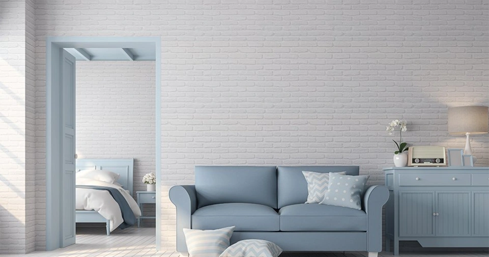
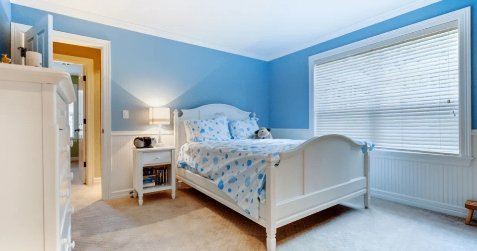
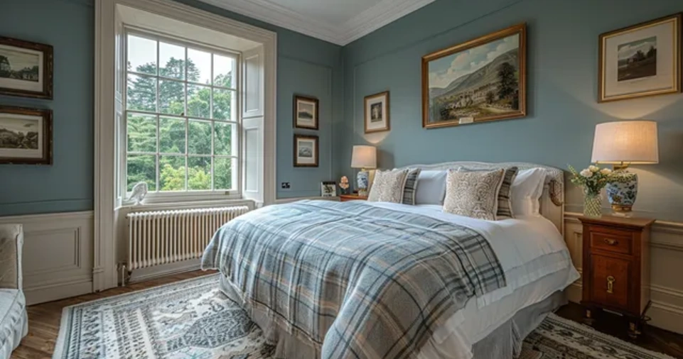
- Bedroom: Opt for calming tones—blues, soft grays, or lavender.
- Bathroom: Light blues, whites, or seafoam greens create a fresh and clean vibe.
- Home Office: Choose a stimulating but non-distracting color like sage green or navy.
Evaluate Natural and Artificial Light
Lighting dramatically affects how a color looks. Observe your room at different times of the day:
- North-facing rooms: Often cooler and benefit from warm tones.
- South-facing rooms: Have lots of light; most colors work well.
- East-facing rooms: Light is warm in the morning and cool later—good for warm hues.
- West-facing rooms: Cooler in the morning and warmer at sunset—consider neutral tones.
Also consider how artificial lighting (LEDs, incandescents, etc.) changes how colors appear.
Sample Before You Commit
Never buy a full gallon without testing first. Buy sample pots and paint large swatches on multiple walls. Observe them during different times of the day and under various lighting conditions.
- Paint at least a 2×2 ft square on each wall.
- Let the paint fully dry before making any judgments.
Create a Flow Between Rooms
To maintain a cohesive feel throughout your home:
- Use a consistent color palette with variations in shade or tone.
- Choose a dominant neutral that ties the rooms together.
- Use accent colors sparingly but strategically for pops of interest.
Don’t Ignore Undertones
A color might be labeled as gray but have undertones of blue, green, or purple. This can clash with flooring, furniture, or other design elements.
- Compare paint swatches next to permanent elements like wood floors or tiles.
- Use online tools or color decks to understand undertones better.
Consider the Finish
Finish affects not only how a paint looks but also its durability:
| Finish Type | Appearance | Best For |
|---|---|---|
| Flat/Matte | No shine | Ceilings, low-traffic areas |
| Eggshell | Low sheen | Living rooms, bedrooms |
| Satin | Soft shine | Kitchens, bathrooms, hallways |
| Semi-gloss | Noticeable shine | Trim, doors, high-moisture areas |
| Gloss | High shine | Cabinets, accents |
Coordinate With Fixed Elements
Paint should complement—not compete with—fixed elements like countertops, cabinets, flooring, or built-in furniture.
- Match warm tones with warm materials (e.g., cherry wood).
- Match cool tones with cool materials (e.g., marble or slate).
Stay True to Your Style
Your personal aesthetic should guide your paint choices. Are you minimalist? Boho? Industrial? Scandinavian?
- Create a mood board of colors, textures, and inspirations.
- Don’t chase trends unless they align with your long-term vision.
Use Color to Alter Perception of Space
- Small Room: Use light colors to make it feel bigger.
- Large Room: Darker shades can make it feel cozier.
- Low Ceilings: Paint ceiling the same color as walls or a lighter version to elevate height.
- Odd Layouts: Strategic accent walls can direct attention or define spaces.
Add Depth With Accent Walls and Two-Tone Treatments
Accent walls can break monotony and add personality. Consider:
- A darker shade of your main wall color
- Bold, contrasting colors in moderation
- Two-tone treatments: painting the bottom half darker and the top half lighter
Keep Future Flexibility in Mind
Think about how easily you can change decor or furniture without having to repaint:
- Stick with versatile neutrals for main walls
- Add color through decor and smaller painted areas
Don’t Rush the Decision
It’s easy to feel pressured to decide quickly, but it’s worth taking the time to get it right.
- Live with samples for a few days
- Compare multiple options
- Trust your instincts once you’ve done your research
ALSO READ: How to Eat Healthier Without a Strict Diet?
Conclusion
Choosing the right paint color goes far beyond what looks good in isolation. It requires understanding color theory, considering light and space, evaluating undertones and finishes, and staying true to your personal style. Taking a strategic approach will help you avoid costly mistakes and create a home that feels cohesive, intentional, and uniquely yours.
By combining logic with creativity and keeping long-term functionality in mind, you can confidently transform any room into a space that looks great and feels just right.


